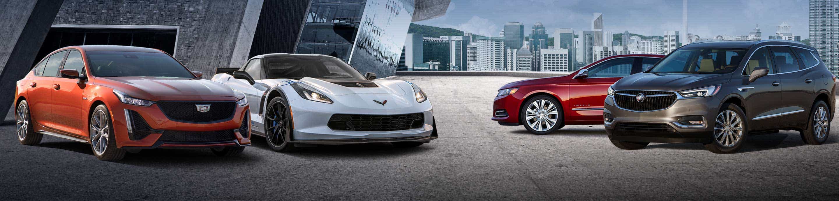
GM Inside News Forum banner
21 - 40 of 57 Posts
Should Buick join Cadillac and really update (they recently introduced a slightly modified logo) their signature crest?

I vote absolutely, the current logo looks terrible on the 2018 Regal Sportback pictured above. I would assume that China would be the sticking point - the old looking logo must be very valuable there for marketing purposes.
What do you think?
.
Like I told my boss when asked for an opinion,,
I dont get paid for thinking..:)
And GM wouldnt give a shyt about my opinion either..do they even read this site?
In case they do,,here goes,,
build the Avista concept,rear wheel drive,and all wheel drive,,full electric..
Or at least drop in a biggest V8 motor available and watch it outsell everything else..
I dont even know or care what Buick badge looks like ..does anyone makes a buying decision on badge design??
I sure dont
 
I think they should change it, but as said above it will not generate sales. But it will be another incremental piece of the puzzle to take away the "old peoples" car image.

Logo's have changed over the decades, its only been in the last few decades that they stopped changing. GM's logo's stopped changing with the times as did their cars. The cars are changing, its ok to change the logo too.

I still get people calling my Cadillac (ATS) and old people's car. I ask if they've ever been in one, always the answer is no. Buick suffers from the same bad image, GM needs to do things big and small to help change perception.
 
I personally think it's completely unnecessary for Buick to change the logo. To be quite honest I see a lot of younger to middle aged women driving Enclave's and the Regal has quite a few younger drivers (myself included) so I feel that Buick's image isn't all doom and gloom. If GM would offer sportier options and more high performance GS models they could help lower the average age even further.
 
I may be in the minority here buy I like the Buick logo as is. Perhaps a slight evolution a la Alfa but hopefully not a major change.

IMO, the Buick logo does look crappy in monochrome. The logos on the steering wheels should be in color, but that's a $0.10 fix.
Easy goy, that $0.10 has to come out of somewhere. I hope you're prepared for a buttonless interior.

A slight evolution would be INTERESTING if by like Alfa you mean a return to a real "crest," which I think would improve it dramatically. The logo as-is looks very cheap and very 2003. Either reduce the "sashing" on the shields, or bring it back to a HERITAGE look and give it some dignity.

Image

Image


Can't say I would bring the ducks back to Cadillac, though.
 
I think they should change it, but as said above it will not generate sales. But it will be another incremental piece of the puzzle to take away the "old peoples" car image.

Logo's have changed over the decades, its only been in the last few decades that they stopped changing. GM's logo's stopped changing with the times as did their cars. The cars are changing, its ok to change the logo too.

I still get people calling my Cadillac (ATS) an old people's car. I ask if they've ever been in one, always the answer is no. Buick suffers from the same bad image, GM needs to do things big and small to help change perception.
^^Yes, but you're referring to dumb :001_9898:s!

Most modern, with-it hep-cats know full well Caddy and Boorik are Youngmobiles!


OK I'll take you on just for spite and to stir something up. Change it to WHAT?
LaSalle. DeSoto. Oldsmobile. Saturn. Uranus. Pontiac. Waxahatchie.

It was a foolish idea to remove the colors to begin with, changing a logo is not going to increase sales. Improving the product will, spending time and resources on things like a logo is a waste.

I just have to wonder if the author has said the same about Mercedes? They have had the same logo forever and have an elderly clientele as well.
Leave my logo alone!


Like I told my boss when asked for an opinion,,
I dont get paid for thinking..:)
And GM wouldnt give a shyt about my opinion either..do they even read this site?
In case they do,,here goes,,
build the Avista concept,rear wheel drive,and all wheel drive,,full electric..AND FLYING CAR TOO!
Or at least drop in a biggest V8 motor available and watch it outsell everything else..
I dont even know or care what Buick badge looks like ..does anyone makes a buying decision on badge design??
I sure dont
Fixed! If you're going to dream, dream big!!

Easy goy, that $0.10 has to come out of somewhere. I hope you're prepared for a buttonless interior.

A slight evolution would be INTERESTING if by like Alfa you mean a return to a real "crest," which I think would improve it dramatically. The logo as-is looks very cheap and very 2003. Either reduce the "sashing" on the shields, or bring it back to a HERITAGE look and give it some dignity.

Image

Image


Can't say I would bring the ducks back to Cadillac, though.
I would replace those Bambis with, oh, say, a lion. Like Peugeot and Holden.
And there should be Secret Messages in those diamonds and the cross. Let's get modern here, folks. Secret messages!
 
Didn't they try to "fix it" by removing the color from it a few years ago? Buick has bigger problems than its logo; first its interior designers need to start looking at what the other manufacturers are doing at similar price points.
I read GMinside news a lot, but its RARE that I comment. I agree with Fun, and other posters that say leave the logo alone. They just brought the color back. A logo represents the brand, but doesn't define the brand. Buick has picked up quite a few accolades on its products in recent years, but they still have room for improvement to be credible in near luxury. They had a lot of bland offerings to make up for. Their bigger worry is where will their products come from now that Opel is gone. If the products don't continue to improve it won't matter what logo they use.
 
OK I'll take you on just for spite and to stir something up. Change it to WHAT?
Buick Feelz?
Buick SJW?
Buick Safety Space?
Buick I live in my mom's basement since I have a bachelors in underwater basket weaving with a minor in contemporary dance and can't find a job?
Bwahahaha... My morning coffee just about came out of my nose!

Awesome!
 
No. The logo is fine and Buick sales are on the upswing, so this is a non conversation. Buick's image as that of an elderly person's car is fading. Fast. Average buyer age is falling.

I think we can all agree, by looking around the new car of the senior citizen set is a Toyota Camry. Lexus too.

There are still Centuries, Lesabres and Lucernes on the road which give the elderly vibe, but those logos aren't the red white and blue.

The one thing I would have done is dumped the LaCrosse name in 2010. The 2005-2009 Lacrosse looks like an old lady car, the newer generations do not. Invicta would have been cool.

Buick could also add some fun colors to the lineup. How about the Avista blue to Lacrosse and Enclave? Stop offering two whites and make one a color.
 
Now I'm not a fan of current Cadillac styling but I was a bit miffed when they got rid of the wreath.
But I do like a couple of the Buick models and my wife and I are getting close to buying a new vehicle.
Getting rid of the Buick logo would seem like a slap in the face.

It is the product, not the logo that sells new vehicles.
Obviously product has to change.
But continuity of the logo is a way to link all your previous and current buyers to future product.
"Yes, we remember you and all the past Buicks that you loved as we work to bring new Buicks for you to love too."
 
I currently drive 2017 Regal. Even though the logo is just chrome on mine. It looks fine.

The issue with the 2018 Regals I saw at the autoshow is instead of adding color to the raised beveled logo, they've made it a cheap picture inside a glass or plastic circle. It looks like a keychain or fridge magnet tacked on to the grill. This is especially strange when on the trunk lid, it is a nicer raised and beveled logo. It's not about the logo as much as it is about execution. And I agree, the colors on the steering wheel logo would look nice. I loved the red dart on my old G6 steering wheel... if nothing else it breaks up the black and chrome interior with a splash of color.
 
Obviously there is a moron so insecure with the tri-shield logo that he probably thinks Buick should use a boring assed big stylized B in a circle. (read boring like the Lexus L logo which look like a big nose).

There are storied European car brands that have always used family crest type logos which they would never consider changing.

I think the Buick logo is still attractive, straight forward and distinctive, especially with the red, white and blue colours.

The tri-sheild emblem was concieved in 1959 to represent the three buicks models they sold at the time, Electra, Invicta and LeSabre.

The only thing Buick needs to do is continue to bring stylish and innovative quality product.
 
I think if you were to place the Buick emblem side by side next to other automotive emblems without any verbage, ask the general population to connect the logo with the brand, I would bet those who would be able to correctly identify the Buick emblem would be few. Sales are up as it is and I don't think you are going to sell one more car with a different emblem. However the logo "properly executed" is extremely important to brand identification. You only need to look to the Chevy Bowtie or the image of the Ram for Ram pickups to see that. Does the current logo represent the brand in a memorable way? I don't think so and we owned a Lacrosse until just recently, so I am a fan of Buick. A logo represents the car and the company. Does the three shield logo do that? I have no idea what it stands for and I doubt there are many that do. So you have logo with a image that few know the meaning of other than you may know that it represents Buick. My personal take on it is that the logo doesn't represent the brand very well, its meaning is lost, it doesn't look that attractive and with sales up, now would be a great time to update the logo.
 
Would love to see an ALL NEW logo. Get rid of all and re-start the brand.

Cars are great but every time I sit in a Buick I see that ugly logo on the steering wheel and I think I don't know if I could look at that every day.
 
I'd make the logo front and rear larger, make it out of quality materials, and wire it for lighting. Switch on dash.
 
I really don't see an issue with the logo. It isn't out-of-date or anything like that. Cadillac removing the wreath from the crest and modernizing the crest worked. I don't know how you modernize a tri-shield.

They've also used that same logo on their very impressive looking concept vehicles and it works just fine. Just peak at the Avista again and see if the badge looks out of place.
 
21 - 40 of 57 Posts